3D Contrast with Ink Blending
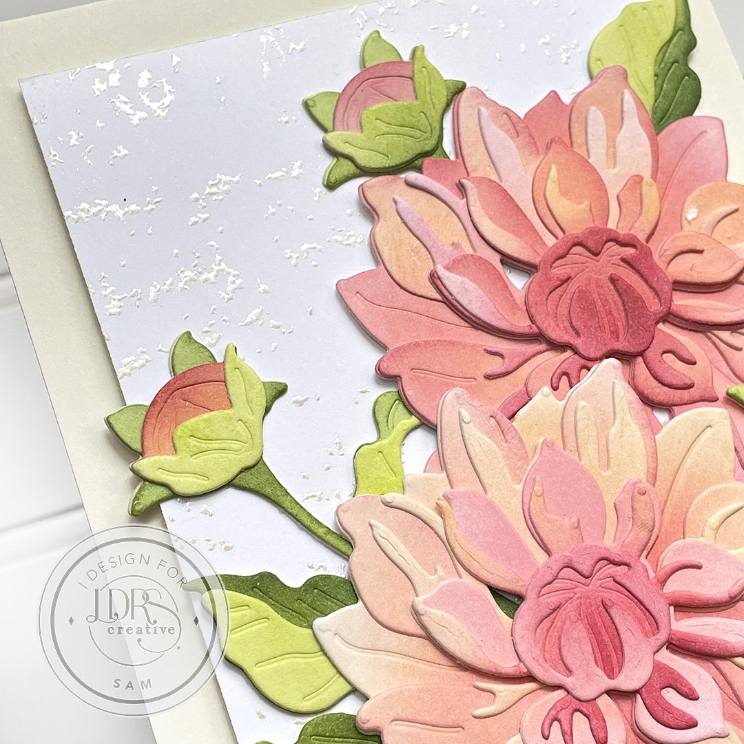
/Sharing a card with the new Summer Collection Dahlia Layering Dies . Isn't the die gorgeous. I just love Dahlia’s and paper ones are no exception. I paired it with the new Natural Granite 6x6 background stamp.

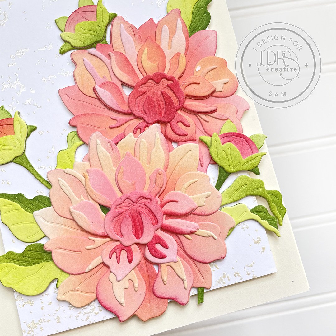
I chose to ink blend all of the layers. I found the beauty when ink blending the petals and leaves is that you don't need to be too precise or perfect. In fact I think that being a little hap hazard with the ink blending and doing a little of one colour here and little bit of another colour there, makes for the perfect layered look and it gives you amazing contrast and depth of colour that makes the flowers stand out - 3D like. You just can’t get the same effect with solid card stock. Kept the background simple with some basic embossed texture and chose to keep a sentiment off the front so as not to take away from the gorgeous flowers.
Get the look:

Starting with the background, gives you a surface to play around on when arranging the flowers.
On a 3 1/2” x 4 3/4” piece of white cardstock emboss the new Natural Granite 6x6 background stamp with pearl embossing powder to create a subtle textured background.
TIP: The Natural Granite 6x6 background stamp is such a useful stamp for adding, a simple texture to a background or even using it to create sand speckles on a beach. Funnily I haven’t even used it yet to create a granite effect.
Adhere the textured background to an A2 ivory card base with foam tape for depth.
There are couple of options when it comes to ink blending the Dahlia Layering Dies dies: 1) You can die cut the petals and leaves first and then ink blend or 2) ink blend and then die cut petals and leaves. For this card I actually did a combination of both these options for the flowers and leaves.
Take a 5 1/2” x 8 1/2 sheet of your favourite ink blending cardstock. (This is a good size to run through the die cutter and also perfectly fits all the petal dies on it for one flower and bud.) Blend a large area of Peachy Keen on the card stock, then randomly ink blend Lipstick Jungle, Pink Tutu and little bit of Scarlett Rose. Lay the petal dies out and die cut. Repeat the step for the 2nd flower. On an A2 size piece of card stock ink blend Key Lime Pie and Olive Branch, then die cut leaves. You should be able to get 2 sets of leaves out of the one piece. At this point you can build the flowers. I however decided to go even further for colour depth and used the remaining ink on the blending tools and added a little bit more ink in places where I felt it was needed. I did this especially to the greenery for a greater contrast between light and dark green and even ink blended a darker green - Evergreen.
TIP: I find an 80lb card stock is perfect to use to build these flowers. It makes the flowers robust without being to weighty. However for the buds I did die cut an additional layer of the stem, since the stem itself is quite narrow and fragile.
Build your flowers, buds and greenery. These flowers are very easy to build especially with the help of the images on the back of the packaging and also lining up the little triangular gaps on the flower petals.
Now for the fun part, working out how you want to arrange your flowers on the card base. Once happy with the layout, I usually take a picture for reference and then either use a wide low tack tape or Press n Seal and then place over the floral arrangement to keep it together. The arrangement can now be manipulated as a unit and glue and foam tape be applied to the back before adhering to the card base.
Somehow I just didn’t want to cover up the large gorgeous floral arrangement with a sentiment, so I dug through my stash of Happy Me, Happy You and Happy Birthday Stacked Sentiments that I will include on the inside once I know who I am giving the card to.
Hope I’ve inspired you to step up your layered die cuts with some ink blending for some 3D contrast. Happy papercrafting : )
